Friday, January 20, 2012

Wednesday, January 18, 2012

Portfolio Addition


Simple portfolio addition: I've been messing with the tile function to create an image that creates a larger design. Originally I wanted to make a Celtic design of sorts but I'm still trying to to get that to work.

Frabjous Day

I finally got the TARDIS to look more or less natural. \o/

I had to make a canvas--and I realized what I was doing wrong earlier; I was trying to place the background at a place besides 0,0 which messed everything up. I then placed my "green-screened" TARDIS at 420, 430 on the canvas and swapped the canvas with the background.

Tuesday, January 17, 2012

Working on Portfolio


As far as the final project goes, I hit many roadblocks today as I realized I am going to have to manipulate some of the codes in some ways I didn't anticipate. I'm essentially going to have to combine swapbg() and placeInCanvas() because Jython is too blunt to have Alpha channels and GRARGH GRARGH GRARGH

So I only have crappy misplaced TARDISes (TARDII?) on a crappy background and one huge green canvas with the TARDIS and a blue sky background somehow.

When I got tired of failing at that, I decided to work on my portfolio images instead and I came up with this. I'm not happy that lossy ol' JPEG ruined how it looks but I am a fan of the final product. I had to tweak a bit of code to get this effect and I used ~multiple~ effects because I can.

The picture is of a friend of mine but run through threeColors and mirrored vertically. I think it looks like he's swinging above a lake now.

Monday, January 16, 2012

Grayscale Attempt


Let's be real, this entire course for me was pretty much an excuse to make images based on Doctor Who. Whatever.

For my first few attempts at a photo mosaic, I tried to make a clock out of David Tennant's face (and that might be the strangest sentence I've ever typed). My first attempt was too blocky so I tried a small image size. I have to work on getting the aspect ratio just right. I think the posted attempt turned out alright, with a nice balance of clarity on what the object is while still retaining a general idea of what the smaller images are, even though I lose a bit of Tennant's face.

Overall I think it's just a crappy base image. :/

What Colour are Your Bits Response

The author of this post, mskala, hithertofore referred to as Ms. Kala or Kala for short, considers the implications of intellectual property and how different people—namely “lawyers” and “computer scientists” feel about them.

Kala says that information can be described as “bits” that may or may not have “Colour,” which basically boils down to the properties that distinguish one thing from another. Kala argues that computer scientists do not see the Colour that files have; they are Colour-blind. They just see the bits that make up a file. However, lawyers believe in the Colour of things because they must judge things by their Colour—meaning that one thing is right and the other is wrong. To them, it matters where the bits come from. Kala’s argument is a bit more complicated than that but I have tried to boil it down for simplicity and argument’s sake.

With that being said, I think Kala brings up interesting points. I would have to side with the lawyers on this issue, because I think it matters where bits come from and what they are meant to do. Just because you scramble up a copyrighted file while it is en route to your desktop doesn’t make it any less illegal that you’ve downloaded it. But at the same time, I understand that to programmers, bits are just bits and it doesn’t matter how they get to where they’re going. I found it interesting when Kala brought up the idea of plagiarism and how bits could occur the exact same without being stolen, but it is very rare. In this way, Colour is vital to keeping the digital world under control. To me, without Colour, you don’t have any way of saying what is right and wrong. Ignoring the philosophical “what is right?” debate, I think no matter which way you look at it, if you get a book or music for free that isn’t in the public domain, it’s illegal. I’m not saying most people haven’t done it and I’m not saying it should be punished as heavily as it is, but technically it’s illegal. Whatever child pornography argument Kala brought up, I didn’t buy—it matters where the bits come from.

Though the idea that Colour doesn’t exist because even tags that give bits Colour are just more bits is fascinating to me. When you start digging this deeply, though, debate almost becomes pointless because everything can be brushed aside. “Why should this be illegal? It’s just information.” I don’t deal with arguing like this very well.

But still, this idea is what torrenters thrive on. Individually, people only submit tiny bits of information. However, when pieced together, you get a torrent of information (such as a movie or a new album). Separately, it doesn’t seem too illegal to download a split second of a movie; however, when you’ve stolen an entire movie, it’s suddenly completely illegal. Where is the line drawn? This seems to be at issue in the article: bit by bit, there is nothing wrong with this. However, the final product is illegal by its very Colour.

Overall, I agree that the digital age has ushered in interesting contradictions in legality. But I don’t think either side is completely right. Like Kala says, computer scientists should try to understand Colour more, but only to try and explain to lawyers why Colour is not that important. The more we immerse ourselves in a digital world, the more loopholes and tenuous distinctions we will have to make.

Hindsight is 255, 255, 255

As we’ve discussed in class, the best ideas are ones that seem obvious after they have been executed (like a blinking cursor). To warrant a patent, an invention must be “nonobvious” so that it took a true innovator to come up with the idea. Herein lies a strange contradiction: if it was obvious, why did no one think of it before? Should the inventor not get a patent? But obviously no one did think of it before, so why shouldn’t he? But how can you patent an obvious idea?

Robert Silvers patented his method of creating photo mosaics because it seemed “nonobvious.” Now we look at his work (and the subsequent work of others) and the idea seems painfully obvious: by making a picture a pixel, it only makes sense that you can make a larger picture out of these pixel-pictures.

In this way, hindsight is not a fair way to evaluate patents. We can argue today that Robert Silvers’ invention does not warrant a patent because photo mosaics seem obvious to us. However, the only reason it seems obvious is because Silvers patented the idea. Silvers used math and technology to write the algorithm that pieces these images together, so I see no problem with giving him credit, since he wrote the code. The only problem that could arise is if someone came up with the idea first and failed to patent it—in which case, you snooze, you don’t get a little “TM” next to your invention.

Saturday, January 14, 2012

Plan


Alright, so I have used Blogspot before, but for whatever reason I've never had this much trouble getting my post to look the way I want it. Whatever.

My plan for my final image is to have a scene that looks like it could be from an episode of Doctor Who. Hopefully, I can utilize most of the tools we have covered so far.

My images include, but are not limited to:
-the base image of a lake
-the TARDIS
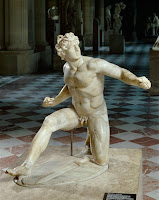
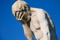
-two statues
-?? (I may add more if I think it looks like I didn't do much. Why go with subtle when you can go with gaudy?)

Since the TARDIS has a white background, I was going to try and replace it with green so I could use swapbg() and place it on the bank of the lake. I have to appropriately scale and place it, which would further require some of the tools we have learned.

The two statues will be interesting. One of them has a lot of background, the other has a simple blue background. The one with a lot of background will probably have to be taken into Photoshop and edited a bit to get it just right, but the other one I should be able to also use swapbg(). My plan is to have one of the statues on the bank and have the other one reflected in the water. It should look like the same statue but in different poses--it's supposed to look alien/mysterious but it may just look goofy, at which point I may have to reconsider a) my life and b) my plan. To make this look right, I'll have to rotate one of the images of the statues, mess with its transparency and its intensity--it must look like it is being reflected in the water.

Wish me luck.

Thursday, January 12, 2012

Experimenting


I was trying to essentially use a green face mask as a green screen so space would show through. Unfortunately, when I made the green threshold low enough that most of her mask would disappear, parts of her skin and hairband would disappear. An interesting image, though. With more distinct green areas, this could be very neat. As of now, she has a shoddy 'space mask.' Ah-heh. Ah-heh.

Thank you, folks, I'll be here all night.

Wednesday, January 11, 2012

Fiddling With JES

I'm trying to figure out how to get the placement of the smaller image on top of the larger image of the lake.

The more tools we get, the more I continue to consider what I will do for my final project.

New Post Because Oldham Said So


Right now I'm just testing out the three color function. I enjoy it greatly. This gave me the idea for doing a three part final project where I zoom out a little bit each image until you get the full image. For example, I could zoom in on what looks like a fruitbowl, and then zoom out and reveal that it is a Hawaiian dancer, and then zoom out further and reveal it is just a plastic dancer on the hood of a car.

Tuesday, January 10, 2012

A Horrible Carr Accident

I think this article raises some interesting points about the effect digital media has on the written word/the English language. I agree that the ease of altering text will have certain ramifications on society, though I doubt they will be as widespread as the author imagines.

Mainly, I have trouble imagining a world where all students use only digital textbooks. We are a world in transition, transitioning away from printed text and into digital text. However, it will take a while for that transformation to be complete and I think that remnants of printed text will still be around even when we solely rely on digital text. Not to be a nerd, but there's an episode of Doctor Who where the Doctor explains why there is a giant library planet--because people miss the smell of books. They miss the touch and the feel of printed text. I think this is very accurate--there's something fundamentally different between reading a book and reading an e-book.

Call me a hopeful believer in our government but I think that as we transition into a digitized world, our laws will progress to prevent too much editing. I don't quite agree with the author thinking that local digital textbooks will be edited to fit in with local bias--or even if they will be, there's no reason towns couldn't edit an analog textbook as well.

Finally, I agree that there has to be a certain amount of closure when printing a book. This closure is lost when the work is done digitally, because editing is so easy to do. I don't see any way around this, though. I think it is a side effect of living in a digitized world. When it comes to poetry and fiction, small edits don't really matter--Walt Whitman edited his work multiple times as he released more and more editions. So long as there aren't insidious edits, I think a little tweaking is fine.

Basically, the author brings up interesting arguments but I think the problems he points out have existed ever since Gutenburg invented the printing press and ever since the Civil War when newspapers became extremely popular. We are a society addicted to information: the constant stream of it, the changing of it, and it doesn't matter in what form we receive it. The transition into digital text is not a problem itself, it is a human "problem."

And that's what I think about this article.

Monday, January 9, 2012

Week 2, Day 1

I attempted to tweak my sepia code to make it work. Today was a slow day as I tried to familiarize myself with the code. I continued to search for images to use in my final project. I have come to the conclusion that Jython itself is not difficult but it is easy to get confused and mixed up with all the variables.

Sunday, January 8, 2012

Weekend Journal #1

Weekend 1
I’m looking for images for my final portfolio. I had a tiny idea of a lake (I think the water nymph image got me thinking) with something reflected in the water that isn’t actually there. I was thinking I could have some kids at the edge of the lake, looking into the water and further off there’s a reflection of a monster or something in the water. And then in the background is the TARDIS. C’mon it’s a good idea for an episode.

I’m still trying to get the hang of assigning variables, making files, and getting them to show up. For whatever reason, it is difficult for me.

For the TARDIS idea, I would have to know how to flip an image, darken it and make it a little more transparent so it looks like it is being reflected. And I’d have to make sure the images blended well together.